
Quality Business Intelligence
Published September 11, 2023
Quality Business Intelligence Subcommittee Contributors: Mark Drzewiecki (chair), Chad Dorgan (vice-chair), Robert Achilles, Steve Black, Brandon Floyd, Brandon Silar, Robert Swink and Angelo Trapani
Recommended Reading
The following are recommended readings to do prior to going through this white paper to provide a good background on work accomplished to date and some context on where quality metrics and artificial intelligence is moving in construction.
The following are recommended readings to do prior to going through this white paper to provide a good background on work accomplished to date and some context on where quality metrics and artificial intelligence is moving in construction.
- History of Quality in Construction
- Measuring Quality in Construction
- The Benefits of AI in Construction (Sumana Roa, Constructible, 4/6/22)
Introduction
When many of us started our journeys in quality, the old adage of “Measure Twice and Cut Once” was likely used to provide a framework on how to get quality from our work. While a very simplistic approach to quality, the adage does bring to the forefront an element that is critical to any quality program - “measure”. However, measure is quite different in this day and age of construction management software, electronic tools, and VDC models.
The measure is now a mountain of data coming at our project teams every day, many of whom can barely keep up with emails and all the urgent calls from the project stakeholders. Therefore, data in itself is not of value unless it provides insight into the project and enables team members to act accordingly, preferably sooner than later and prior to significant issues from occurring. This is where Quality Business Intelligence (QBI) comes in.
When looking at business intelligence relative to quality, it is more of a journey you are on than simply a program or destination. This is primarily because you will always need to address new data, changes in technology, and improve how you analyze and use the insights gained. This paper is intended to provide you guidance and best practices learned, from CQEC members on their QBI journey, to make your journey easier and quicker. However, as you will see, QBI is as much about culture as it is the information.
Your QBI journey, and this paper, is divided into four main sections:
As mentioned, QBI is a journey you are starting or are already on. As you go through this paper, take time to look at the pro tips (side bars) on how to apply the information into your company and improve as you go. We have all learned through trial and error on this and hope that your journey is shorter than our's.
When many of us started our journeys in quality, the old adage of “Measure Twice and Cut Once” was likely used to provide a framework on how to get quality from our work. While a very simplistic approach to quality, the adage does bring to the forefront an element that is critical to any quality program - “measure”. However, measure is quite different in this day and age of construction management software, electronic tools, and VDC models.
The measure is now a mountain of data coming at our project teams every day, many of whom can barely keep up with emails and all the urgent calls from the project stakeholders. Therefore, data in itself is not of value unless it provides insight into the project and enables team members to act accordingly, preferably sooner than later and prior to significant issues from occurring. This is where Quality Business Intelligence (QBI) comes in.
When looking at business intelligence relative to quality, it is more of a journey you are on than simply a program or destination. This is primarily because you will always need to address new data, changes in technology, and improve how you analyze and use the insights gained. This paper is intended to provide you guidance and best practices learned, from CQEC members on their QBI journey, to make your journey easier and quicker. However, as you will see, QBI is as much about culture as it is the information.
Your QBI journey, and this paper, is divided into four main sections:
- Start Measuring Something and Establish a Culture: It is best if you start small and begin with data you have or something new for quality (see the Measuring Quality in Construction white paper published by CQEC). By starting small, you are able to understand the challenges of collecting data, how to analyze it, and more importantly, how to report and take action on the data. This is the first step in establishing a positive culture needed for successful QBI.
- Step Up the Game: Once you have learned a little, and have had some successes with the data, it is now time to step up your game and begin looking at business intelligence approaches and tools. This starts with understanding your data ecosystem and working to find and share value in your data. Along the way, you will need to choose a Business Intelligence Platform (BIP) and increase your skill in using the platform.
- Moving from Reactive to Predictive: After you have gained insight through your platform and understand your key performance indicators, trends, and challenges; the next step is to start a move from reactive metrics (those that indicate something bad or good already happened) to predictive metrics (those that provide insight and a warning that something bad or good is likely to happen). This is obviously a key goal of QBI, to use data to avoid issues, but it is also one of the hardest elements to get working successfully.
- Next Steps: The last section in this paper looks at where QBI is going as technology and business intelligence improves (including research needed), the use of artificial intelligence, and how industry standardization could help us all.
As mentioned, QBI is a journey you are starting or are already on. As you go through this paper, take time to look at the pro tips (side bars) on how to apply the information into your company and improve as you go. We have all learned through trial and error on this and hope that your journey is shorter than our's.
Section 1: Start Measuring Something
The first step in any journey, and sometimes this is the most difficult step, is to just start. For your QBI journey, your first step is to start measuring something that will provide value to your company and to drive the culture required for open and honest reporting of the good, the bad, and the ugly. The three steps in starting your journey are:
- You Already Have Data - You’ll be amazed at how much data you already have! The challenge is how to prioritize and find the data that drives your quality program forward.
- Report and Share - Once you have identified your key initial data points, you will need to report and share the results, which will allow for appropriate actions to be taken by leadership and project teams.
- Establish a Culture - Finally, you must set the stage to establish the culture for your long-term QBI journey to be successful.
You Already Have Data
With the advancement of technology in companies, going from simple desktop machines to now cloud-based comprehensive software platforms, most businesses have access to large volumes of data. For the past couple of decades, business intelligence has grown from traditional back-of-house operations such as accounting and human resources. It has transitioned from complicated spreadsheets to multi-system data lakes to aggregate and analyze mass flows of data across systems.
However, the construction operations and quality elements of business intelligence have only relatively recently been developed. The majority of QBI elements started with basic equipment and knowledge, and an appetite for testing and learning, all within the last decade. Although this corner of business intelligence is in its toddler stages, we have collectively accelerated our advancement by coming together as an industry to provide you with your first steps to start inside your company, which include:
Develop Some Basic Training in Data Fundamentals
An essential first step is to get your company aware of the fundamentals surrounding data and business intelligence. This can easily be accomplished through on-line training through any number of vendors (many offering free training). The goal of this training is to have your employees (key leaders and team members at a minimum) understand the terminology so that when developing your QBI, and working with vendors, there is clarity in communication.
While not required until you adopt a BIP, many firms have begun their QBI journey by hiring a Data Analyst who already has a level of expertise with data management, analysis and BIP’s. This resource is often a shared resource across business service groups, such as Operations, Accounting, Safety and Pre-Construction, to help distribute the cost.
Quality Data Strategy Drivers
Before taking a deep dive into your existing data, it is important to first identify what your key strategy drivers are in your company, and for quality specifically. The importance of identifying the strategy drivers is that these support and enable the culture required to consistently capture the quality data that is required. Without the culture, it will be difficult to obtain the data in the first place. We have found that the strategy drivers allow you to achieve an early win, which gains momentum in the work that follows.
A great way to identify your strategy drivers is to conduct brainstorming events, interviews or surveys with key team members who will define, guide and support your QBI journey. These should include:
To better engage, consider ways to cross-pollinate individuals across your company, For instance, pairing field and management members in a single forum may spur additional discussion that may not happen if these members were engaged individually.
With the advancement of technology in companies, going from simple desktop machines to now cloud-based comprehensive software platforms, most businesses have access to large volumes of data. For the past couple of decades, business intelligence has grown from traditional back-of-house operations such as accounting and human resources. It has transitioned from complicated spreadsheets to multi-system data lakes to aggregate and analyze mass flows of data across systems.
However, the construction operations and quality elements of business intelligence have only relatively recently been developed. The majority of QBI elements started with basic equipment and knowledge, and an appetite for testing and learning, all within the last decade. Although this corner of business intelligence is in its toddler stages, we have collectively accelerated our advancement by coming together as an industry to provide you with your first steps to start inside your company, which include:
- Data Fundamental Training
- Strategy Drivers
- Existing Data
Develop Some Basic Training in Data Fundamentals
An essential first step is to get your company aware of the fundamentals surrounding data and business intelligence. This can easily be accomplished through on-line training through any number of vendors (many offering free training). The goal of this training is to have your employees (key leaders and team members at a minimum) understand the terminology so that when developing your QBI, and working with vendors, there is clarity in communication.
While not required until you adopt a BIP, many firms have begun their QBI journey by hiring a Data Analyst who already has a level of expertise with data management, analysis and BIP’s. This resource is often a shared resource across business service groups, such as Operations, Accounting, Safety and Pre-Construction, to help distribute the cost.
Quality Data Strategy Drivers
Before taking a deep dive into your existing data, it is important to first identify what your key strategy drivers are in your company, and for quality specifically. The importance of identifying the strategy drivers is that these support and enable the culture required to consistently capture the quality data that is required. Without the culture, it will be difficult to obtain the data in the first place. We have found that the strategy drivers allow you to achieve an early win, which gains momentum in the work that follows.
A great way to identify your strategy drivers is to conduct brainstorming events, interviews or surveys with key team members who will define, guide and support your QBI journey. These should include:
- Company executives
- Project executives
- Project superintendents
- Project engineers
- Owner representatives
- Design professionals
- Preconstruction managers
To better engage, consider ways to cross-pollinate individuals across your company, For instance, pairing field and management members in a single forum may spur additional discussion that may not happen if these members were engaged individually.
Pro-Tip: Strategy Drivers Questions
The following questions should be integrated into your method of identifying your key Strategy Drivers:
The following questions should be integrated into your method of identifying your key Strategy Drivers:
- How do you currently evaluate quality on a project?
- What is the level of rework on projects?
- What are current project Key Performance Indicators (KPI) used by leadership?
- How are projects evaluated/rewarded for performance?
- If a project has an issue, what do they do? Who do they contact?
- How do external parties evaluate your performance?
- How are systemic issues across projects identified?
- How are lessons shared across projects?
From the engagement of your key team members, your goal is to identify the key strategy drivers around three primary elements of quality in your company:
It is important to understand where you are currently rather than where you want to be. If your current strategy driver is to report issues, it may actually limit the data you can ultimately get.
Identify Existing Data
Once you understand your key strategy drivers, you are now ready to identify the existing data available to you. Where you will look for data will depend upon what type of systems you have in place and how robust those systems are. Some key places to look for quality data include:
- Rework - What is your company’s approach to documenting and sharing rework on projects? This could range from complete isolation (hidden on projects) to full transparency (document and track rework at company level).
- Reward - How are projects rewarded? This could range from pure financial (profit made) to full stakeholder engagement.
- Knowledge - How is knowledge shared across projects? This is the same range as rework.
It is important to understand where you are currently rather than where you want to be. If your current strategy driver is to report issues, it may actually limit the data you can ultimately get.
Identify Existing Data
Once you understand your key strategy drivers, you are now ready to identify the existing data available to you. Where you will look for data will depend upon what type of systems you have in place and how robust those systems are. Some key places to look for quality data include:
- Spreadsheets - What spreadsheets are used by leaders and managers in your company. This could range from project pursuits, estimating all the way through to warranty management and legal claims. Getting copies of your various spreadsheets and parsing out the key quality data elements is often a goldmine of information.
- Project Shared Drives - Take a look at the shared drives on several of your projects for what information is being stored. This could range from quality kick-off meeting minutes to mock-ups, observation reports or even submittals.
- Construction Management Systems - Most construction management systems will include all of the above information along with much more, with the ability to track submittals, RFIs, meetings, observations/tests/inspections and even warranty issues.
- Financial Systems - All of the costs associated with a project, from pursuit through warranty.
- Risk Management/Legal Systems - The identification and tracking of all project claims.
Pro-Tip: Summarizing Your Current Data
As you collect and identify your current data, it will be important to summarize what you have access to and your evaluation of the completeness and quality of the data. This will be invaluable as you adopt a BIP. Creating a simple table with the following columns is a great place to start:
As you collect and identify your current data, it will be important to summarize what you have access to and your evaluation of the completeness and quality of the data. This will be invaluable as you adopt a BIP. Creating a simple table with the following columns is a great place to start:
- Data Source - where is the data coming from - spreadsheet, system, etc.
- Data Element - a simple title of the data - this could be rework category, rework cost, etc.
- Data Completeness - provide an estimate of how complete the data is across your company - if you feel you are only capturing 20% of all rework on your projects, then state that.
- Data Quality - what is your trust in the data that is captured - if you believe all data is accurate, then put 100%, if not, put a lower value.
As the intent of your first step into QBI is intended to be small, once you have collected and consolidated the list of data available, you should focus on identifying five or less key data points. This will keep the scope manageable and allow for quicker feedback from your company on the value of capturing and communicating around the data. Remember, you are looking for a few quick wins on highlighting quality data, not to fully transform your company - it is a journey!
Report and Share
In order to get a quick win, you must report and share the data you have identified in the previous section. This is probably the hardest step to take and it is very dependent upon the culture of your company and how information is shared and communicated. This is especially challenging in companies that have little communication and those that are very siloed (between projects, departments, regions, etc.).
This is a key reason we recommend you start small with five or less quality metrics, so that you can quickly learn what works, what does not work, and how best to expand what is being captured and reported on.
To start your reporting and sharing of quality metrics, you should take each metric through an evaluation relative to the following items:
- How can the metric support and complement your company’s existing metrics?
- How can the metric be effectively reported to your organization?
- How can the metric be compared to other metrics/data/projects?
Pro-Tip: Action-Focused Perspective
Many CQEC members started their QBI journey reporting every metric they could find, with up to 60 data points for each project.
What we learned from this is that it was not the data that was important, but what action the data prompted from leadership/project.
Therefore, a best practice in reporting quality metrics is to understand what action is expected to be accomplished. If no action is expected, then it is just information and not an important metric. Remember, action can be negative in nature (rework) or positive in nature (project lunch).
The final step in reporting and sharing your quality metrics is to assess how effective it is across your company. This will inform you on what is working (keep doing), what is not working (change or stop doing) and how best to continue your QBI journey.
Support and Complement Existing Metrics
In the early phases of your QBI journey you can improve acceptance of your initial quality metrics by aligning with the existing metrics utilized by your company. This is a reason that many CQEC members started their QBI journey with the Quality Incident, as it piggy-backed the existing Safety Incident culture and processes.
A great way to think about this is that you are packaging (or repackaging) a quality metric to something that your company is already comfortable with. For example, costs and schedules typically already have robust reporting processes and metrics. If you can integrate your quality metrics into one of these work processes, then getting the data is greatly simplified. A side benefit of this alignment is that you, as the quality leader, are not responsible for getting the data, as it is a pre-existing process that is the responsibility of someone else already.
Also, by starting and aligning with existing metrics, you are able to maintain this data as a core part of your QBI journey, thus allowing integration into your future BIP and the development of “historic” metrics, along with easy buy-in from the stakeholders that will support you and your program from within your organization.
Effective Reporting for Your Organization
As introduced in the Pro-Tip above, effective reporting is where the quality metric elicits an action from company leadership or the project team themselves. By starting with a few quality metrics, you are able to define what is effective reporting for your organization. There are several elements to reporting that should be considered and implemented during this initial trial:
In general, we have found that a best practice is to follow existing reporting cadence and approaches at the start, as these are accepted by your company and you are going with the current instead of fighting the current (less effort on your part). Your goal should be to start with the existing state and introduce change in small increments so that the focus is on the metric and action desired and not a major change to the reporting process.
Can the Data be Compared?
An easy way for quick early successes is to look for opportunities that expand the usefulness of your data by combining several metrics on a project that enables comparison across projects. To compare across projects, you can consider one or more of the following denominators:
By aligning metrics into unit averages, project team or business unit performance can be compared and opportunities for improvement will become more defensible.
Assess Effectiveness
Your final step at the start of your QBI journey is to assess the effectiveness of your initial quality metrics. Did they work, how is your reporting, what is the feedback from your leaders, and what will you change? This should be a series of PDCA (Plan-Do-Check-Act) events where you do continuous improvement of your initial metrics and reporting. Several items to consider on assessing your effectiveness:
Support and Complement Existing Metrics
In the early phases of your QBI journey you can improve acceptance of your initial quality metrics by aligning with the existing metrics utilized by your company. This is a reason that many CQEC members started their QBI journey with the Quality Incident, as it piggy-backed the existing Safety Incident culture and processes.
A great way to think about this is that you are packaging (or repackaging) a quality metric to something that your company is already comfortable with. For example, costs and schedules typically already have robust reporting processes and metrics. If you can integrate your quality metrics into one of these work processes, then getting the data is greatly simplified. A side benefit of this alignment is that you, as the quality leader, are not responsible for getting the data, as it is a pre-existing process that is the responsibility of someone else already.
Also, by starting and aligning with existing metrics, you are able to maintain this data as a core part of your QBI journey, thus allowing integration into your future BIP and the development of “historic” metrics, along with easy buy-in from the stakeholders that will support you and your program from within your organization.
Effective Reporting for Your Organization
As introduced in the Pro-Tip above, effective reporting is where the quality metric elicits an action from company leadership or the project team themselves. By starting with a few quality metrics, you are able to define what is effective reporting for your organization. There are several elements to reporting that should be considered and implemented during this initial trial:
- Frequency - What is the typical reporting frequency within the company and what is reasonable for the collection of data, analysis, and reporting for you. Monthly is typically a great starting point, but no longer than quarterly (weekly is not recommended).
- Existing Reports - Can you integrate into an existing report that leadership/projects get. Several CQEC members started their journey by integrating into existing monthly project reports to leadership, or into the monthly scheduling update.
- Action Trigger - Through your interaction with leadership (strategy driver engagement) were you able to identify when action would be taken on a metric. For example, leadership is only concerned when rework is above a certain value (e.g., $20k), or when submittals are so many weeks (e.g., 3 weeks) past due date?
- Highlight/Trend - Though more advanced, is there an opportunity to highlight the metric based on status/action trigger? This could simply be red or green based on status. Also, is it possible to easily show if the metric is trending up or down (and is that good or bad)?
In general, we have found that a best practice is to follow existing reporting cadence and approaches at the start, as these are accepted by your company and you are going with the current instead of fighting the current (less effort on your part). Your goal should be to start with the existing state and introduce change in small increments so that the focus is on the metric and action desired and not a major change to the reporting process.
Can the Data be Compared?
An easy way for quick early successes is to look for opportunities that expand the usefulness of your data by combining several metrics on a project that enables comparison across projects. To compare across projects, you can consider one or more of the following denominators:
- Work completed - How much work was completed in a set timeframe (week, month, etc.) so that one project that completed twice as much work (dollar value or man-hours) is comparable to another one.
- Size of project - The physical size of a project (square footage) can enable comparison - such as incidents per 10k square feet.
- Work element - Comparing by work element (civil, mechanical, structural, etc.) between projects can enable identification of systemic issues quicker.
By aligning metrics into unit averages, project team or business unit performance can be compared and opportunities for improvement will become more defensible.
Assess Effectiveness
Your final step at the start of your QBI journey is to assess the effectiveness of your initial quality metrics. Did they work, how is your reporting, what is the feedback from your leaders, and what will you change? This should be a series of PDCA (Plan-Do-Check-Act) events where you do continuous improvement of your initial metrics and reporting. Several items to consider on assessing your effectiveness:
- Identify Positives - What is working and what do people like about the reporting? This can be a simple survey or interviews with key team members.
- Biggest Challenges and Hurdles - What has been the biggest challenge in rolling out the new metrics/reporting and where has been the greatest resistance from the company? Consider breaking this into project level and leadership level as the challenges are typically different for the two groups.
- Actions Taken - What actions were taken by individuals or project teams based on the metrics? A great approach to this is to gather “stories” from your projects on how they reacted based on your new metrics/reporting.
Pro-Tip: Reporting Exceptions
In reporting to senior leadership, your goal is to provide them with information that will result in a desired action - just providing them with metrics without action is of little value to your company.
A great approach is to create reports that focus on exceptions. You only highlight items which have passed a certain threshold (exception) which action needs to be taken.
To get this to work in your company, consider the following:
Note that your report could include several levels of exceptions using color coding, with deeper shades of red being worse.
In reporting to senior leadership, your goal is to provide them with information that will result in a desired action - just providing them with metrics without action is of little value to your company.
A great approach is to create reports that focus on exceptions. You only highlight items which have passed a certain threshold (exception) which action needs to be taken.
To get this to work in your company, consider the following:
- Identify the key metrics that drive the behavior you want.
- Work with leadership to identify what is “good” and “bad”. Essentially at what point would they want to become involved?
- Create a report that filters to only include projects that are beyond the exception
Note that your report could include several levels of exceptions using color coding, with deeper shades of red being worse.
Establish a Culture
Starting your QBI journey slowly allows you to build the culture required for the long-term success of reporting across your company. The biggest challenge we face, as an industry, is that problems on projects just get taken care of and are often not reported. There is also a strong resistance to report problems/failures over a concern of repercussions.
Therefore, establishing a culture of openness and honesty is essential for your success. To accomplish this, you need to:
Getting Ahead of the Negative
The biggest challenge you will have, and one that can kill driving a culture of openness, will be getting ahead of leadership reacting negatively to a project reporting a problem on their project. When CQEC members started their QBI journeys, everyone experienced negative responses from leadership as that had been their historic reaction. Leadership had conditioned themselves as they rarely heard the bad news.
Therefore, as part of your QBI launch, it is important to get ahead of any negative reaction to project’s reporting. A best practice is that you have an open discussion with leadership by asking them how they would respond to a series of “what ifs”, such as:
If the immediate reaction is negative back to the project, for example “How can they mess up so much?”, then you have more work to do. However, if it is more on “How do we learn from this?” and “How to move forward?”, you are on the right track. While being frustrated, mad, and concerned are all valid feelings for leadership to have, how they respond has to be tempered so that projects continue to report and resolve issues.
Ultimately, reporting by projects comes down to a “what’s in it for me” approach. If they report and are chastised, then there is nothing in it for them but grief. However, if they get support, technical resources, and quicker resolution to their problems, they see value in reporting.
Remind your team that comprehensive reporting promises to identify opportunities to learn and improve on repetitive processes, reduce re-work, enhance physical safety, streamline necessary workflows while eliminating redundant work, and strengthen job security by minimizing risk and protecting profitability on a company-wide basis.
Starting your QBI journey slowly allows you to build the culture required for the long-term success of reporting across your company. The biggest challenge we face, as an industry, is that problems on projects just get taken care of and are often not reported. There is also a strong resistance to report problems/failures over a concern of repercussions.
Therefore, establishing a culture of openness and honesty is essential for your success. To accomplish this, you need to:
- Getting ahead of the negative
- Avoid the data black hole
- Celebrating honesty
- Sharing tangible rewards
Getting Ahead of the Negative
The biggest challenge you will have, and one that can kill driving a culture of openness, will be getting ahead of leadership reacting negatively to a project reporting a problem on their project. When CQEC members started their QBI journeys, everyone experienced negative responses from leadership as that had been their historic reaction. Leadership had conditioned themselves as they rarely heard the bad news.
Therefore, as part of your QBI launch, it is important to get ahead of any negative reaction to project’s reporting. A best practice is that you have an open discussion with leadership by asking them how they would respond to a series of “what ifs”, such as:
- Water pipe breaks and floods four floors of completed work.
- Subcontractor is 3 weeks behind schedule
- Opportunity to increase margin by 1%, but by backcharging subcontractor
- Average of 3 cycles to get every submittal approved
If the immediate reaction is negative back to the project, for example “How can they mess up so much?”, then you have more work to do. However, if it is more on “How do we learn from this?” and “How to move forward?”, you are on the right track. While being frustrated, mad, and concerned are all valid feelings for leadership to have, how they respond has to be tempered so that projects continue to report and resolve issues.
Ultimately, reporting by projects comes down to a “what’s in it for me” approach. If they report and are chastised, then there is nothing in it for them but grief. However, if they get support, technical resources, and quicker resolution to their problems, they see value in reporting.
Remind your team that comprehensive reporting promises to identify opportunities to learn and improve on repetitive processes, reduce re-work, enhance physical safety, streamline necessary workflows while eliminating redundant work, and strengthen job security by minimizing risk and protecting profitability on a company-wide basis.
Pro-Tip: What’s in it for me? Time
When the reporting tool automatically notifies the responsible party that action is required it saves the person making the report from walking back to the office and sending an email. Some sophisticated tools will allow the party to report back that the action has been completed so the issue can be closed out efficiently.
Documenting compliant materials, conditions or installations can save hours or days of project staff time at the back end of a project when a client challenges that the work was completed properly.
Avoid the Data Black Hole
One of the worst things that you can do is to have all of your projects report data to you, but then they do not hear or see what happens to their efforts - we call this a data black hole as the information goes in but nothing comes out.
In order to avoid the data black hole, it is important that prior to asking for data from your projects, you have already planned what you are going to do with the data and have started on what your messaging will be back to your projects. While the details and the actual message will likely change, by planning for this continuous feedback loop to your projects, you will increase engagement from the projects and their willingness to share.
A few best practices in planning for the feedback are:
Celebrate Honesty
The biggest action that you can take to drive a positive culture is to celebrate honesty - the good, the bad, and the ugly. What is important is that you focus on the fact that it was reported, not necessarily what was reported.
There are three ways in which you can celebrate honesty:
Tangible Rewards
Reinforcing reporting and honesty across your company has a direct impact on improving reporting and getting better information to drive your program. Recognition and rewards can be a valuable tool in accomplishing this. To be successful, any recognition or reward needs to be valued by the individuals in the organization and you need to avoid the reward being the only reason for reporting.
Several approaches taken for recognition and reward by CQEC member companies include:
One of the worst things that you can do is to have all of your projects report data to you, but then they do not hear or see what happens to their efforts - we call this a data black hole as the information goes in but nothing comes out.
In order to avoid the data black hole, it is important that prior to asking for data from your projects, you have already planned what you are going to do with the data and have started on what your messaging will be back to your projects. While the details and the actual message will likely change, by planning for this continuous feedback loop to your projects, you will increase engagement from the projects and their willingness to share.
A few best practices in planning for the feedback are:
- Highlight the positive - Resolve the negative: the tone you set in communicating the results of the data are essential (see next section on Celebrating Honesty) and that you include both what is working and what needs improvement, both in a positive light.
- Less is more - If there are pages and pages of information to look through, most people will not look at it. Therefore, keep your message focused and often as short as possible to allow for understanding.
- Clarity of action - Does your messaging include what action should be taken? Ideally, continuing the positive and resolving the negative.
Celebrate Honesty
The biggest action that you can take to drive a positive culture is to celebrate honesty - the good, the bad, and the ugly. What is important is that you focus on the fact that it was reported, not necessarily what was reported.
There are three ways in which you can celebrate honesty:
- Top-Down Communication - Everyone responds to what their direct manager prioritizes. If they are engaged in reporting both good and bad items, then their teams will be honest on their reporting. In addition, if teams hear from the CEO a story of the importance of reporting issues, this goes a long way in driving your culture.
- Superintendent Driven - Most companies have a venue for their superintendents to gather and learn from each other. Within this safe space, having each superintendent share an issue and how it was resolved, will enable them to learn from each other, but also to bring those lessons back to their projects and have others see the importance of honesty across the organization.
- Project Meeting - As your quality leadership visits projects, it is essential that you review the status of data reporting, lessons learned and how the information gained has shaped your quality program and how it can directly improve the project you are on.
Tangible Rewards
Reinforcing reporting and honesty across your company has a direct impact on improving reporting and getting better information to drive your program. Recognition and rewards can be a valuable tool in accomplishing this. To be successful, any recognition or reward needs to be valued by the individuals in the organization and you need to avoid the reward being the only reason for reporting.
Several approaches taken for recognition and reward by CQEC member companies include:
- Newsletters - When publishing a quality newsletter you can recognize projects or individuals who have reported the best (most).
- Best Project - For companies recognizing their best projects, integrating reporting as an evaluation criteria to help drive reporting over time. Make sure to communicate that the best project was not just due to making money.
- Events - Do a project lunch for your best reporting project each quarter to highlight what they have done (publicize it to get others to follow).
- Gift Cards - You can use gift cards to recognize projects or individuals for reporting that was aligned to the desired culture you want.
Section 2 - Step Up the Game
With the successes you have had during the startup of your QBI journey, it is now time to step up the game and take a broader look at data, quality, and advanced tools to supercharge the value you get from your journey. This includes:
- Data Ecosystem - To ensure your journey provides the highest value to your organization, you first need to understand all of the data available and how they are interconnected.
- BI Platform Adoption - Next, with data spread across multiple locations, systems, and platforms; it is important to identify and utilize a BI Platform to consolidate, clean, analyze, and report your data.
- Build Your Quality Brand - A picture is worth a thousand words is an appropriate analogy for BI systems, where a visual is worth ten thousand data points. However, it is not just the visual, but how you build your Quality Brand through the visuals which is more important.
- Visualization Best Practices - Establishing your framework and standards on developing and deploying visualizations will greatly improve implementation and acceptance of your QBI.
- Creating Valuable Results/Action Across Your Organization - The final step is to ensure you have a feedback loop to verify your QBI program is creating valuable results and associated actions across your organization.
Data Ecosystem
During the start of your QBI journey you gained some familiarity with your organization's data and you started to pick data points that provided immediate value to your quality program and your organization. Now you need to take a deeper dive to understand where all of your data lives within and across your various systems and repositories.
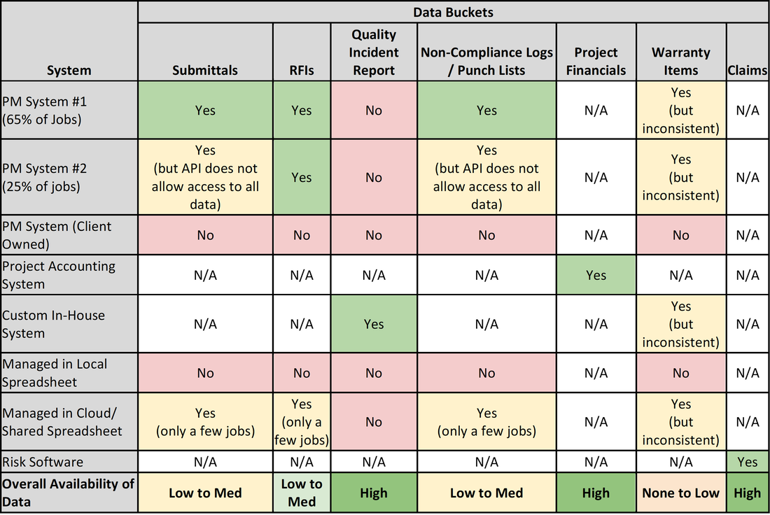
This is best accomplished by developing a related set of tables or diagrams of your data ecosystem with an overall Datamap using a Data Ecosystem Table (DET), see Table 1, and details on each data point within the Datamap using a Data Bucket Summary (DBS), see Table 2.
If you’re like most firms, your Datamap will be quite complex because your data resides in multiple locations, softwares, spreadsheets, and database files.
In developing your DET, you first start with identifying all of the locations that data is collected and processed, which span your typical business systems of project management programs, financial programs, risk management/legal programs, and even human resource programs. These are put in the first column of the DET.
The next step is to identify the key data buckets that package together key data points which are relevant to your company and quality program. These can be considered as work processes accomplished by your company and include such items as:
You then identify where the data resides across each system and data bucket. What you will likely find is that the data could reside in multiple locations depending upon the project size, legacy systems, and inconsistent application of company policies and procedures. This becomes especially challenging when core systems are being changed (i.e., moving to a new construction management system).
Table 1 - Data Ecosystem Table (DET) Example
During the start of your QBI journey you gained some familiarity with your organization's data and you started to pick data points that provided immediate value to your quality program and your organization. Now you need to take a deeper dive to understand where all of your data lives within and across your various systems and repositories.
This is best accomplished by developing a related set of tables or diagrams of your data ecosystem with an overall Datamap using a Data Ecosystem Table (DET), see Table 1, and details on each data point within the Datamap using a Data Bucket Summary (DBS), see Table 2.
If you’re like most firms, your Datamap will be quite complex because your data resides in multiple locations, softwares, spreadsheets, and database files.
In developing your DET, you first start with identifying all of the locations that data is collected and processed, which span your typical business systems of project management programs, financial programs, risk management/legal programs, and even human resource programs. These are put in the first column of the DET.
The next step is to identify the key data buckets that package together key data points which are relevant to your company and quality program. These can be considered as work processes accomplished by your company and include such items as:
- Submittals
- Request for Information (RFI)
- Quality Incident Report
- Non-Compliance/Punch List Item
- Project Financials (bid to warranty)
- Warranty Item
- Claims
- Employee Experience
- Project Contacts
- Safety Incident Report
- Lessons Learned
- Meeting Minutes
- Correspondence (including e-mails, texts, etc.)
You then identify where the data resides across each system and data bucket. What you will likely find is that the data could reside in multiple locations depending upon the project size, legacy systems, and inconsistent application of company policies and procedures. This becomes especially challenging when core systems are being changed (i.e., moving to a new construction management system).
Table 1 - Data Ecosystem Table (DET) Example
|
|
Once the DET is completed, the next step is to document the data fields within each data bucket. While this could be consolidated into the DET, a best practice is to have a separate table with the detailed data points for better understanding and maintenance. An example data bucket for a Quality Incident Report is shown in Table 2. In addition to the critical data point titles, it is helpful to track additional info about each object. In the provided example, the “format” of the data and whether the data is a “required” input during a reporting task is captured.
Table 2 - Data Bucket Summary (DBS) Example
Table 2 - Data Bucket Summary (DBS) Example
|
|
It is important to understand that, because you have identified data points in your datamap, it does not mean that it is accessible for your QBI needs. Systems may lack API (Application Programming Interface) connectivity, may have restricted access to sensitive data, or are stored in proprietary formats, among other issues. Therefore, it is essential that you identify and verify what your Critical Data Points are relative to your QBI strategy and then work with your IT department on the best way to access and consolidate the data (see next section on BI Platform Adoption).
Pro-Tip: Too many data points can be overwhelming.
Most software systems gather tens or hundreds of additional data points beyond which is considered to be “critical” for your quality program. Therefore, it is recommended that you remain focused on a short list of data points which are useful to your QBI strategy and avoid data-saturation without action. You can add data points as you advance your QBI journey.
Most software systems gather tens or hundreds of additional data points beyond which is considered to be “critical” for your quality program. Therefore, it is recommended that you remain focused on a short list of data points which are useful to your QBI strategy and avoid data-saturation without action. You can add data points as you advance your QBI journey.
Your last step in completing your datamap is to identify your organization’s Master Data Points, which are critical fields established within your company that allows for connection and comparison of information across systems. The typical Master Data Points to identify include:
It is important to define both the location where these Master Data Points are created and stored, and the process to which they are created. For example, is a new Project Number generated in your Construction Management Software or in your Financial Program, and then how is it populated/used in other systems?
- Project Number
- Employee Number
- Claim Number
It is important to define both the location where these Master Data Points are created and stored, and the process to which they are created. For example, is a new Project Number generated in your Construction Management Software or in your Financial Program, and then how is it populated/used in other systems?
BI Platform Adoption
With your datamap completed, you will see that your organization creates a significant amount of data, each day, across many different systems and platforms. However, from a business intelligence perspective, having the data spread across multiple systems makes it near impossible to see the whole picture, much less analyze and trend to identify hot spots which need attention immediately. This is where BI Platforms come in. A BI Platform connects to each of your systems and consolidates the Critical Data Points into a centralized repository (called a Data Lake) for storage, analysis, filtering, and reporting.
BI Platform Selection
The identification and adoption of a BI platform for your organization can be a considerable undertaking as it should include every department within your organization as they will both be contributing data to the platform and using the platform for their analysis and reporting purposes.
Therefore, if your organization has not chosen a BI Platform, it is recommended that you engage your organization’s IT professionals to ensure critical logistics, system access, and privacy concerns are all considered in BI Platform selection. Also, as a cross-department tool, IT typically takes the lead on BI Platform adoption (next section). The typical items to address with IT prior to starting BI Platform selection includes:
- Current Software Licensing Agreements - You may be surprised to know that you already own a BI tool as part of a larger suite agreement with a current software provider.
- Proprietary or Personal Information - Some of the data you will request will be part of datasets which include proprietary or otherwise sensitive data (e.g., financial, HR) which may need to be scrubbed, credentialed, or anonymized as part of the consolidation to your data lake.
- On-premises vs. Colocation vs. Cloud Storage - Various storage options are available and may already be used by your organization for data/information storage. The location of this data may have their own unique security considerations.
- Complementary Datasets - Relational datasets may be available outside of your Data Ecosystem Table which help you contextualize your data with additional information. These complementing datasets may even be necessary to make sense of complicated business shorthand like identification codes, nested objects, or naming.
- Existing Database Views - IT professionals may already have existing data views constructed for other divisions/departments of your organization which could be enhanced or modified to serve multiple BI endeavors at once. Syncing these efforts establishes cross-disciplinary discussions which may create efficiencies in branding, reporting, key indicator development, etc. Database administrators are also often able to aggregate multiple resources into a single, simpler ‘view’. This sort of external data organization can speed-up and simplify the later development of data reference mapping used by your business intelligence system.
- Data and/or System Development Resource Needs - IT professionals are the best place to start when discussing staffing needs for creating and maintaining your QBI as specialists are required for consistency of BI execution and trust in the information being reported. They are the people most familiar with the detailed characteristics of a myriad of computing science professions, and are typically aware of opportunities for synergy across your organization, potentially green-lighting support resources earlier than otherwise budgeted due to these efficiencies.
- Connectivity Abilities - Your organization’s adopted BI Platform will be able to connect in various ways through API’s, Data Connectors, etc. Your IT professionals will be able to handle credentialing and connection logistics as you proceed.
Pro-Tip: Selecting Your BI Platform
There are several factors to consider in selecting your BI Platform that will enable your QBI strategy and journey. The key ones to consider include:
There are several factors to consider in selecting your BI Platform that will enable your QBI strategy and journey. The key ones to consider include:
- General System Capabilities - Create a table comparing the key system capabilities (consider having your potential BI Platform Vendors doing this for you) to understand the pros and cons of each system.
- Ease of Use - How intuitive is the platform to navigate and use. At a minimum, evaluate how data is connected, cleaned, put into the data lake, filtered/analyzed, and how reports, graphics, and dashboards are created; all with the novice user in mind.
- Where the System Resides - The system (data) could be located in the cloud (off-site), could be on-site (IT room), or could be co-located (both on-site and in the cloud). The location impacts speed, performance, and accessibility upon communication failure.
- Ownership of the Data - When you decide to move to another BI platform, who owns the data and how easy will it be to port to a new system?
- Training Requirements and Who will provide this - Related to the ease of use will be how training will be accomplished, what level of training is required, and who will provide the training.
- BI Platform Maintenance - As the BI Platform connects to all of your other core systems, constant maintenance is required as those other systems change (get upgraded) as well as business needs (data analysis) change. What are the resources required to maintain the platform?
- Cost and Terms of License Agreement - Last, but not least, is how much will the platform cost to purchase, on-board, and renew each year? Be mindful of low first cost proposals with high “per-user” fees (each license cost is high).
QBI Team Creation/On-Boarding
Once your organization has selected a BI platform, it is time to begin populating the system with your quality elements. A best practice is to create a cross-functional QBI team responsible for accomplishing this. While the specific staffing and size of the team will vary for each organization based on needs, at a minimum the team should be composed of:
The team will need to be trained on the BI Platform, gain alignment on the datamap for quality, and prioritize the creation and launch of your Quality Dashboards within the BI Platform.
Depending on the size and resources of your company, the complexity of a company’s existing data systems, and the BI Platform selected; you should strive for your BI Specialist to be dedicated to Quality, as they will be key for successful implementation and utilization. However, most of these specialists will work very closely with, if not directly employed within, a company’s Information Technology (IT) department.
Once your organization has selected a BI platform, it is time to begin populating the system with your quality elements. A best practice is to create a cross-functional QBI team responsible for accomplishing this. While the specific staffing and size of the team will vary for each organization based on needs, at a minimum the team should be composed of:
- Quality Representative - An individual from the quality group who understands your processes, policies, procedures, and has a good grasp on data analytics.
- Preconstruction Representative - An individual experienced in preconstruction processes and data flow.
- Construction Representative - An individual (preferably at the manager or director level) with multiple years of construction experience and leadership.
- BI Specialist - An individual credentialed in business analytics and the specific BI Platform chosen.
- Senior Leadership QBI Sponsor - A senior level leader (VP or above) who is the sponsor of your QBI program.
The team will need to be trained on the BI Platform, gain alignment on the datamap for quality, and prioritize the creation and launch of your Quality Dashboards within the BI Platform.
Depending on the size and resources of your company, the complexity of a company’s existing data systems, and the BI Platform selected; you should strive for your BI Specialist to be dedicated to Quality, as they will be key for successful implementation and utilization. However, most of these specialists will work very closely with, if not directly employed within, a company’s Information Technology (IT) department.
Build Your Quality Brand
While selecting and starting to use your BI Platform is a huge step in your QBI journey, it will only be truly successful if you use the platform to fully build and communicate your Quality Brand (what you want your quality program to be known for, which will continue to perpetuate your program long after you retire). Don’t worry, however. Like everything else covered, building your brand is composed of small steps and on-going attention rather than a massive change in what you are doing.
Once you have adopted a BI platform and have trained around its toolsets, it is time to start developing a stack of visualizations. Utilizing adaptive graphical visualizations, with clarity, is the promise of the new suite of BI softwares; and is the gold standard when presenting data to users in a manner that is digestible. However, given the amount of data points available, it’s quite easy to present too much data. Overwhelming users with too much data may cause so-called “analysis paralysis” where actionable items become difficult to identify. To avoid such “information overload”, it’s important to start simple and approach the visualization task in a way that is concise and only elaborative where necessary.
Up to this point, there have likely been many comments within your team or company about the type of visuals that would be helpful, or discussions about a grand set of visuals that your team would like to test. Some of this info may have been offered during the “Interview Your Team” outreach from chapter one of this whitepaper. Hopefully, you have been logging these visions of your BI system because now is the time to take a pause on the software toolset and strategize about which are most critical at the outset.
The best approach is to start the visualization development slowly and to focus on the most critical visualizations. The importance of starting small is that it allows you to quickly:
A key element of these initial visualizations is to define your user groups (e.g., the “customer” for the visualization). A great way to think about this is the root system of a tree, where each root would be data/visualization at the project level. These team-facing visualizations will typically focus on the one project, with the ability by the team to slice (filter) their data based on different elements impacting the defined variable. For example, they may want to look at by time period, scope of work, trade partner or quality incident category.
As you move up the root system, the visualization will need to consolidate multiple roots (projects) so that project leadership will see details across their projects. Then, when you get to the trunk of the tree (senior leadership), they need to see across all projects at a high level to see hot spots needing their attention.
Depending upon the visualization, the data access and filtering may be further defined for consumption by other project stakeholders. For example, a great visualization could be the age of submittal reviews/approvals on a project. However, instead of just showing the current project details to your design partners, what if you gauged their performance against other similar (yet anonymous) projects?
Defining the groups receiving the visualization is essential as a strategic task. It is also important to understand how data will be filtered as it moves from the project level to senior leadership. We recommend putting pen-to-paper and developing a simple outline of these groups and the level of information provided to drive quality action. For example, Table 3 shows how group definitions could be used for a Quality Incident Graphic:
Table 3: Quality Incident Graphic Group Definition
While selecting and starting to use your BI Platform is a huge step in your QBI journey, it will only be truly successful if you use the platform to fully build and communicate your Quality Brand (what you want your quality program to be known for, which will continue to perpetuate your program long after you retire). Don’t worry, however. Like everything else covered, building your brand is composed of small steps and on-going attention rather than a massive change in what you are doing.
Once you have adopted a BI platform and have trained around its toolsets, it is time to start developing a stack of visualizations. Utilizing adaptive graphical visualizations, with clarity, is the promise of the new suite of BI softwares; and is the gold standard when presenting data to users in a manner that is digestible. However, given the amount of data points available, it’s quite easy to present too much data. Overwhelming users with too much data may cause so-called “analysis paralysis” where actionable items become difficult to identify. To avoid such “information overload”, it’s important to start simple and approach the visualization task in a way that is concise and only elaborative where necessary.
Up to this point, there have likely been many comments within your team or company about the type of visuals that would be helpful, or discussions about a grand set of visuals that your team would like to test. Some of this info may have been offered during the “Interview Your Team” outreach from chapter one of this whitepaper. Hopefully, you have been logging these visions of your BI system because now is the time to take a pause on the software toolset and strategize about which are most critical at the outset.
The best approach is to start the visualization development slowly and to focus on the most critical visualizations. The importance of starting small is that it allows you to quickly:
- Identify different graphics to represent the information
- Gauge how the visualizations are received
- Gain feedback on hitting your Quality Brand messaging
- Accomplish several improvement loops to hone the visualization and Quality Brand
A key element of these initial visualizations is to define your user groups (e.g., the “customer” for the visualization). A great way to think about this is the root system of a tree, where each root would be data/visualization at the project level. These team-facing visualizations will typically focus on the one project, with the ability by the team to slice (filter) their data based on different elements impacting the defined variable. For example, they may want to look at by time period, scope of work, trade partner or quality incident category.
As you move up the root system, the visualization will need to consolidate multiple roots (projects) so that project leadership will see details across their projects. Then, when you get to the trunk of the tree (senior leadership), they need to see across all projects at a high level to see hot spots needing their attention.
Depending upon the visualization, the data access and filtering may be further defined for consumption by other project stakeholders. For example, a great visualization could be the age of submittal reviews/approvals on a project. However, instead of just showing the current project details to your design partners, what if you gauged their performance against other similar (yet anonymous) projects?
Defining the groups receiving the visualization is essential as a strategic task. It is also important to understand how data will be filtered as it moves from the project level to senior leadership. We recommend putting pen-to-paper and developing a simple outline of these groups and the level of information provided to drive quality action. For example, Table 3 shows how group definitions could be used for a Quality Incident Graphic:
Table 3: Quality Incident Graphic Group Definition
|
|
Visualization Best Practices
In order to build your Quality Brand through visualizations, there are several best practices that can be implemented in creating and deploying your initial visualizations. These include:
Figure 1 provides two examples of action-based illustrations that define both performance and goals.
Figure 1: Example of an Action-Based Illustration with Desired Goal Identified
In order to build your Quality Brand through visualizations, there are several best practices that can be implemented in creating and deploying your initial visualizations. These include:
- Existing KPI’s - It is good practice to maintain visualizations and key metrics that predate your BI platform, which your audience types already utilize and are familiar with. Capitalizing on this familiarity is a great strategic step to build adoption of your visualization. It limits your audience’s initial learning to the challenges specific to the BI toolset, since the data being visualized is presented in a format familiar to the audience. Once the novelty of the visualization tool set wanes, it will likely be easier to incrementally adopt new layouts, KPIs, and filters without overwhelming your audience.
- Form Factor - Assess the form-factor through which your audience will be consuming the visualizations. One audience may review from a computer screen using a software client. Some traveling audiences may be more likely to use a web app view on a laptop screen. Other audiences may consume reporting on mobile devices like tablets or phone screens. Ideally, visualizations will adjust given the size of the screen but that’s not always the case.
- Recurrent Formatting and Language - It is also best practice to define and align around standards for formatting, language, and style to be used. Having a plan for formatting can include color, font size, page layout, etc.; whereas language can include titling, units, disclaimers, prompts, etc.
- Baselining - Adding comparative baseline data in the visualization helps provide your audience with context without requiring them to leave the visualization for a research task. For instance, on a project-focused visualization, it can be helpful to list multi-project averages, or other historic info, to illustrate project data in context. Best practice is to use a consistent baseline (same year) across all of your visualization when possible.
- Trend Inclusion - Although this can be considered a next-level topic (elaborated in the next chapter), simple trend identification can help clarify overwhelming datasets for easy consumption, especially on macro-level visualizations. Taking some time at the outset to plan for trend visualizations, to complement complex data sets, can help bring data-heavy topics back into alignment with the goal to “simplify” visualizations.
- Action-Based Illustration - These visualizations are best utilized when their clarity easily spurs action. Take some time to discuss how best to present the visualization in a way that compliments a specific audience’s work process. By strategizing on ways to “indicate toward” and serve up actionable intelligence, your visualization will more likely become an indispensable tool that supports the improvement of your audience’s work product. For example, you might be able to show a hard-line goal, with visual progress toward that goal over time.
Figure 1 provides two examples of action-based illustrations that define both performance and goals.
Figure 1: Example of an Action-Based Illustration with Desired Goal Identified
|
|
Ultimately, your efforts on defining and documenting strategy during early visualization development will support and drive your Quality Brand and bring consistency across your QBI platform. Your strategy does not need to be complicated or locked-in with no ability to change, and can often be developed in a simple meeting, with no more than a pen and paper in-hand. Identifying these strategic goals can prevent rework, support clarity in communication, and keep operational intent in clear focus throughout a varied set of visualizations as you launch the platform and start making your data illustration decisions.
Creating Valuable Results/Action Across Your Organization
The last phase in Stepping Up Your Game is to bring everything together and create a simple dashboard for your stakeholders to interface with your QBI visualizations, with the ultimate goal of each stakeholder taking the appropriate action based on what they are provided. Just as each visualization is tailored to the recipient, each dashboard can also be tailored to drive action.
While it would be great to just give you QBI dashboards which you could use, the reality is you need to develop and experiment with dashboards that work to highlight and drive your Quality Brand and company culture. What works for one company may not translate to another company.
However, there are generic starting points on layouts which have worked across the industry and maximize action across the organization. By starting with simple sketches or mock-ups you can quickly experiment what works best for your company and then, as your BI sophistication matures, additional graphs and visualizations can be added.
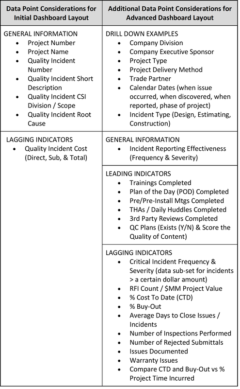
Table 4 provides some key data points to consider in your layout.
Table 4: Key Datapoints for Quality Dashboard Creation
The last phase in Stepping Up Your Game is to bring everything together and create a simple dashboard for your stakeholders to interface with your QBI visualizations, with the ultimate goal of each stakeholder taking the appropriate action based on what they are provided. Just as each visualization is tailored to the recipient, each dashboard can also be tailored to drive action.
While it would be great to just give you QBI dashboards which you could use, the reality is you need to develop and experiment with dashboards that work to highlight and drive your Quality Brand and company culture. What works for one company may not translate to another company.
However, there are generic starting points on layouts which have worked across the industry and maximize action across the organization. By starting with simple sketches or mock-ups you can quickly experiment what works best for your company and then, as your BI sophistication matures, additional graphs and visualizations can be added.
Table 4 provides some key data points to consider in your layout.
Table 4: Key Datapoints for Quality Dashboard Creation
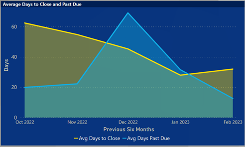
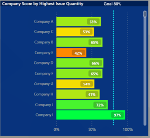
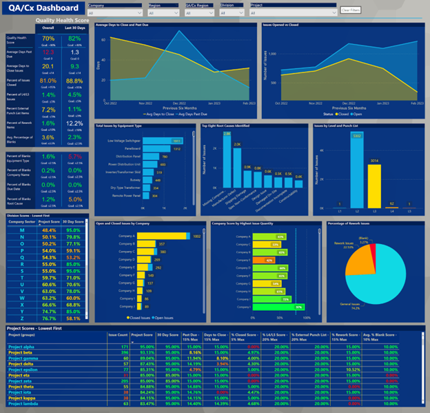
The dashboard illustrated below is intended for company leadership as it shows cumulative data from all projects across the company. As you can see, it is a mix of data tables and graphics, each telling a different story. Tables are used to provide very specific information but may take more time to digest for some readers. Bar charts and pie graphs are great to quickly digest the specific information and put into context for the viewer. You can also use bold text to draw the viewer to pertinent information and trends. As shown in Figure 2, differing formats can complement one another to provide digestible data to a wide array of audience types.
Figure 2: Example Quality Dashboard
Figure 2: Example Quality Dashboard
Remember, the most critical element of the dashboard is that it drives action by those interacting with it. Therefore, consider adding a few highlights or embellishments to the various elements on your dashboard:
A potential challenge of dashboards is that the data is being consolidated from a variety of sources, each of which have different update frequencies. What this can cause is a discontinuity in action triggers between the different data elements on the dashboard. For example, if Quality Incidents are updated daily/weekly, yet construction project cost expenditures are updated monthly, then the age of data will be different between the two, especially if using the two in a calculation (i.e., QI’s/Project Cost). Unless all data consolidation is automated and “live”, you will face challenges on proper interpretation of the data and desired action to be taken. To alleviate concerns, you have two primary solutions for non-live dashboards:
As dashboards are created, it’s also important to consider the reliability of the data presented. In other words, how much do you trust the data and the insights it provides? There are many factors that contribute and affect this analysis, including:
- Tables - Utilize a red-yellow-green highlighting to focus the user on data points of concern.
- Bar Charts - Add notes/callouts (using data label features) to identify data points of concern.
- Pie Charts - Order the data in priority of action, with the largest pie slice being the most relevant for action.
- Percentages - Add target percentages to indicate if on-target or not
A potential challenge of dashboards is that the data is being consolidated from a variety of sources, each of which have different update frequencies. What this can cause is a discontinuity in action triggers between the different data elements on the dashboard. For example, if Quality Incidents are updated daily/weekly, yet construction project cost expenditures are updated monthly, then the age of data will be different between the two, especially if using the two in a calculation (i.e., QI’s/Project Cost). Unless all data consolidation is automated and “live”, you will face challenges on proper interpretation of the data and desired action to be taken. To alleviate concerns, you have two primary solutions for non-live dashboards:
- “Push” Periodic Dashboards - Your first option is to push the dashboards out to your teams on a periodic basis which is determined when all data is aligned and updated. The downside of this is project stakeholders have to wait to get relevant and actionable data.
- Data Source Notes - Your second option is to add notes to your dashboard highlighting where the information is coming from and how often it is updated. This provides the user with information on how best to interpret the dashboard and when to take action. However, there is a risk of low acceptance for the dashboard as too hard to understand and use.
As dashboards are created, it’s also important to consider the reliability of the data presented. In other words, how much do you trust the data and the insights it provides? There are many factors that contribute and affect this analysis, including:
- Data Completeness
- Is data being collected from all sources? If not, how much of the data may be missing?
- For voluntary data such as Quality Incidents, not all incidents may be captured. How confident are you on the completeness of such reporting?
- What is your sample size in terms of number of projects, number of incidents, and number of years collecting data?
- One thing to consider for getting and tracking data completeness is measuring "blanks" of required data fields, this helps to quickly identify the missing data fields.
PRO TIP: Quality Incident Data Completeness
Anecdotally, CQEC members estimate that between 20 and 40% of Quality Incidents are being reported consistently. A best practice is to evaluate your highest reporting projects (most Quality Incidents per unit of project cost) to your average projects to understand variance in reporting.
In comparing the project groups, identify if the trends in reporting (type and category of incidents) are similar. If they are, then you are still getting valuable data from under-reporting projects. If there are wide variances in trends, you will need to identify the root cause of under-reporting and address it.
Another best practice is to establish an expected minimum reporting frequency, based on your analysis, that will help identify variances in reporting. Typical CQEC members have found a rate of one Quality Incident for each $1 to $4 million in project cost to be reasonable, but you will have to evaluate what benchmark works best for your company.
- Data Bias
- When entering data, users may purposefully enter data incorrectly in an effort to shift blame.
- While discovering such data bias can be difficult, look for anomalies that are difficult to explain. For example, if there are an unusually high number of vendor errors for self-perform work activities, that could be an indication of a data bias.
- User Errors
- Are users entering data incorrectly unintentionally? For example, if a steel contractor damages adjacent glass due to weld splatter, should that incident be categorized under Div 5 - Metals or Div 8 - Glass?
- Are users selecting the correct Root Cause? Data errors such as this are best managed through internal training. Despite training, it can be very challenging to avoid a certain level of data entry errors. Such errors will skew the data. How can this be measured?
- Data Cleaning
- In all data systems, the cleaning and filtering of data throughout the data hierarchy is a critical step. If the data is incomplete or contains errors or misrepresentations, the entire system it supports (e.g., KPIs, dashboards, reports) can become unreliable. A commonly cited adage in data science is “garbage in, garbage out.”
- This topic, by itself, is enough to fill its own textbook so it will not be handled as a component of this paper. But a failure to understand the basics of your data cleanliness can spell doom for the QBI system on top of it.
- At this point, it is appropriate enough to identify any data science expertise in-house, to seek out introductory data science education, and to integrate a data cleanliness step into your workflow.
Section 3 - Moving from Reactive to Predictive
Around 2010, the CQEC board was reviewing the shared Quality Incident data from the member companies and one company was having a high number of incidents relative to roofing, but not the other ones. Jump two years forward, and the other member companies began reporting roofing issues. Jump another two years forward and our insurance company members indicated an increase in roofing claims.
While these are based on reactive metrics, the incident occurred. It did highlight to the CQEC leadership that even with reactive metrics, there can be early predictors of larger issues. This small discussion is what led many member companies to look into their data and thus start their QBI journey. What it also did was to start the initial discussion on how do we move from a very reactive approach to data, where we are always trying to catch up to issues, to that of a predictive approach, where the project data identifies an issue before it occurs.
The good news is we have come a long way on understanding the approach to predictive measures since 2010, but there is a long way to go where we can rely on the predictive nature of models and QBI platforms. There are six items to consider to start moving your QBI from reactive to predictive:
- Leading Indicator Analysis - As you have already accomplished a significant amount of work in setting up and managing your QBI program, one of the best places to start is analyzing your data for leading indicators.
- Utilizing Data at Key Decision Points - You can also start small by looking at key decision points in a project and what data would be helpful to make better, more informed decisions.
- Insight at the Point of Work - Case Study Example - Ideally, you can go beyond key decision points and provide insight to the individual as they are doing their work.
- Automating Risk Avoidance - The next level is to automate the risk avoidance process so that your standard work processes do not allow you to go down negative paths.
- Business and Strategic Planning - Ultimately, predictive analytics need to go beyond the project level and become a standard part of business and strategic planning.
- Industry Trends - Predictive analytics should also be shared across companies to highlight industry trends and take advantage of the four years from the roofing example to eliminate issues before they become insurance claims in other companies.
Leading Indicator Analysis
A leading indicator is a data point you can look at and use to predict how a project will perform based on current state conditions and trends. Relevance is often provided to leading indicators by historic data (you know if the indicator is X, then Y is likely to happen). An example of a leading indicator from your school days was how you performed on quizzes and homework in preparation for a test. If you were getting A’s all along, you were pretty confident on getting an A on the final. Conversely, if you were getting C’s all along, it is likely you will end up with a C on the test. As you can probably see from this simple example, leading indicators are not perfect, but are critical to starting your journey to the predictive side of QBI.
The question then becomes, how do I identify leading indicators for my project?
A good starting point is to identify what are the early activities in a project that set the pace and direction for the project, as the earlier we can look at an indicator, the longer time we have to react before it becomes a problem. Simply put, looking at warranty calls on a project will not help change the end result of the project.
A good leading indicator will have:
Based on this criteria, several common leading indicators you could consider are:
As you can probably see from this list, these data points only become predictive if there is the historic context. For example, what is a good cycle time, does the project size and complexity impact results, and is a high number of RFI’s good or bad?
What we have found is that by starting with one or more of these and establishing your baselines (historic data), you can then start to look at projects that vary significantly from baseline (1-2x) as the starting point for intervention. This will give you time to learn the leading indicators and when to and not to react.
A leading indicator is a data point you can look at and use to predict how a project will perform based on current state conditions and trends. Relevance is often provided to leading indicators by historic data (you know if the indicator is X, then Y is likely to happen). An example of a leading indicator from your school days was how you performed on quizzes and homework in preparation for a test. If you were getting A’s all along, you were pretty confident on getting an A on the final. Conversely, if you were getting C’s all along, it is likely you will end up with a C on the test. As you can probably see from this simple example, leading indicators are not perfect, but are critical to starting your journey to the predictive side of QBI.
The question then becomes, how do I identify leading indicators for my project?
A good starting point is to identify what are the early activities in a project that set the pace and direction for the project, as the earlier we can look at an indicator, the longer time we have to react before it becomes a problem. Simply put, looking at warranty calls on a project will not help change the end result of the project.
A good leading indicator will have:
- Repetition - you are getting multiple data points in order to identify trends.
- Short Cycle Times - there is a limited amount of time between data points.
- Easily Available - the data is captured already as part of your systems/processes.
- Historic Context - data sets are available from past projects to identify the relationship between the data point and project outcomes.
Based on this criteria, several common leading indicators you could consider are:
- Submittal Process
- Cycle Time
- Number of Cycles
- Approved with Comments
- Requests for Information
- Cycle Time
- Number of Cycles
- Unresolved RFI’s
- Preinstallation Meetings
- Trade contractor on-boarding times (the time from Subcontract Award to the Pre-Installation Meeting) - note that different scopes of work have different baseline on-boarding times
- Number of planned meetings vs number of actual meetings
- Number of Preinstallation Meetings Required to get Closure
- Key Attendee Participation
- Planned vs Actual Preinstallation meetings
- Employee Training
- Identify required courses for team members
- Planned trainings vs actual trainings
- Track percentages of those courses completed vs incomplete
As you can probably see from this list, these data points only become predictive if there is the historic context. For example, what is a good cycle time, does the project size and complexity impact results, and is a high number of RFI’s good or bad?
What we have found is that by starting with one or more of these and establishing your baselines (historic data), you can then start to look at projects that vary significantly from baseline (1-2x) as the starting point for intervention. This will give you time to learn the leading indicators and when to and not to react.
PRO TIP: Using Training to Drive Performance
Training is critical for the proper execution of projects and your quality program. Tapping into and using training data is a great way to drive your quality reporting and data robustness. By understanding where training is lacking, you can focus efforts to improve project team performance.
Training is critical for the proper execution of projects and your quality program. Tapping into and using training data is a great way to drive your quality reporting and data robustness. By understanding where training is lacking, you can focus efforts to improve project team performance.
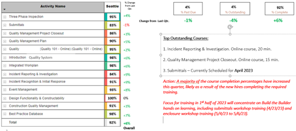
Utilizing Data at Key Decision Points
The next opportunity for predictive analytics is to look at key decision points in your processes and what information is valuable to make decisions. You are likely already doing this to some degree with key performance indicators and benchmarks, such as during the bidding process to determine which bids are valid and are not valid.
Key decision points to consider are:
These examples are not intended to be all inclusive or even right for your projects, but rather to give you an idea of how to approach identifying your key decision points. Once you have a decision point identified, then you need to understand how the decision is made at that key point, and more importantly, what data could be used to improve the decision made.
For example, one that you should consider is how do key project milestones drive the overall project? We can all understand the topping out ceremony and the importance to the owner and project team to hit the date. Have you analyzed how having that milestone drives early project execution? While topping out is a great event, a more important one for quality and the completion of the project is the dry-in date for the building, when the building enclosure is complete and you transition to full interior production drywall and finishes. What data could you track on projects that would show the value of an established Building Dry-In Milestone (and party of course)? Consider comparing projects with and without the formal milestone and compare:
The next opportunity for predictive analytics is to look at key decision points in your processes and what information is valuable to make decisions. You are likely already doing this to some degree with key performance indicators and benchmarks, such as during the bidding process to determine which bids are valid and are not valid.
Key decision points to consider are:
- Bid Submission - Prioritization of bids based on qualifications and past performance.
- Project Sequencing - The flow of the project and the size of areas relative to the overall success of the project.
- Established Key Project Milestones - What key project milestones were established and how they drive project performance. Milestones to consider are:
- Foundation Start
- Topping Out
- Building Dry-In
- System Start-up and Commissioning
- Future Work - How is the project evaluated to determine future work pursuit. Either to pursue or not to pursue, and which project partners to prioritize?
These examples are not intended to be all inclusive or even right for your projects, but rather to give you an idea of how to approach identifying your key decision points. Once you have a decision point identified, then you need to understand how the decision is made at that key point, and more importantly, what data could be used to improve the decision made.
For example, one that you should consider is how do key project milestones drive the overall project? We can all understand the topping out ceremony and the importance to the owner and project team to hit the date. Have you analyzed how having that milestone drives early project execution? While topping out is a great event, a more important one for quality and the completion of the project is the dry-in date for the building, when the building enclosure is complete and you transition to full interior production drywall and finishes. What data could you track on projects that would show the value of an established Building Dry-In Milestone (and party of course)? Consider comparing projects with and without the formal milestone and compare:
- Rework of interior finishes due to weather events
- Days required to install finishes (normalized for project size)
- Number of scheduling changes required during finishing work
Insight at the Point of Work - Case Study Example
It's amazing what you can learn when you start to analyze thousands of points of data and look for patterns and anomalies. However, trying to figure out what it all means and where to go next can be a bit overwhelming. A good approach is to start with what you would like out of the data and work your way back from there. The following is a case study example from an owner who has established a very robust data collection process for all of their projects, focused on construction, start-up, and commissioning.
During the process of constructing and commissioning these facilities, thousands of data points are being collected in the form of “issues”. An issue being defined as a non-conformance regarding either the building or equipment that requires action by a particular party to correct the non-conformance. Within the issues themselves, there are multiple attributes, or data fields, that can be isolated later for analysis. These fields can typically be customized, see Figure 3, based on the software platform being utilized and can provide avenues to collect specific types of data, including date, type, responsible party, priority, status, etc.
Figure 3: Example of an Individual Issue Detail with Customizable Fields
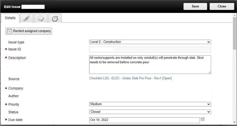
As with any project, if issues are not resolved in a timely manner, they can overwhelm a project team whereby value to the project degrades. Therefore, the first data element important to focus on is how well are issues being managed and resolved? For this example, the owner identified seven key performance indicators (KPI’s) to help drive issue management behaviors:
In this example, each KPI was given a max point value of 14.3 (1/7th of 100) and a corresponding goal, which was established by the owner to drive their overall construction quality program. What is important to focus on is that metrics and goals for the issue management process were established ahead of time, which were understood by all affected parties. Seven specific metrics were identified to track issue management behaviors, and then funneled into an overall quality health score for the project that can be easily understood by viewers not involved in day to day operations on the project. Specific metric goals can be developed prior to start of construction either by the owner themselves, the contractor, or through a partnering session involving appropriate stakeholders.
From this foundation, through business intelligence platforms, dashboards can be created to help understand and drive focus. Figure 4 is based on data updated daily and available to all team members to track progress and see where resources need to be allocated to keep issue management on track.
Figure 4: Example of a Dashboard to Track Issue Management Metrics
- Average days past due
- Average days to close
- Average equipment issue rate
- % high / critical issues
- % late project issues
- % closed issues
- % damage after install
In this example, each KPI was given a max point value of 14.3 (1/7th of 100) and a corresponding goal, which was established by the owner to drive their overall construction quality program. What is important to focus on is that metrics and goals for the issue management process were established ahead of time, which were understood by all affected parties. Seven specific metrics were identified to track issue management behaviors, and then funneled into an overall quality health score for the project that can be easily understood by viewers not involved in day to day operations on the project. Specific metric goals can be developed prior to start of construction either by the owner themselves, the contractor, or through a partnering session involving appropriate stakeholders.
From this foundation, through business intelligence platforms, dashboards can be created to help understand and drive focus. Figure 4 is based on data updated daily and available to all team members to track progress and see where resources need to be allocated to keep issue management on track.
Figure 4: Example of a Dashboard to Track Issue Management Metrics
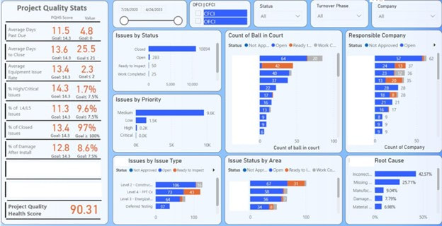
Another example of a critical analysis which can be accomplished on issue data is to evaluate how issues occurring at different points in construction impact the overall project schedule. By overlapping as-built schedules with an abundance of issue information, patterns can be identified. In the world of commissioning (Cx), there are typically five phases of equipment/system installation, startup and testing, including:
Through analysis in this particular case study, the projects with higher levels of success meeting Cx schedule milestones typically had fewer issues as they entered Level 3, which is essentially when the power is turned on. Once this milestone was achieved, any lingering issues would require a formal Method of Procedure (MOP) to de-energize the equipment properly and safely. MOP’s need to be reviewed by multiple parties to ensure proper compliance and minimize further impacts to concurrent and subsequent activities. This process takes additional time and resources away from the project teams, and adversely affects the flow of the Cx process.
Therefore, if open issues could be resolved at a higher rate prior to energization, this would effectively minimize the complicated MOPs that need to be coordinated and reduce impacts to the project. Through data analysis, adverse trends can be identified and mitigation strategies can be implemented to drive a desired outcome. As in this particular case, high emphasis was placed on issue resolution prior to initial equipment energization, thus reducing MOP’s required to resolve the issues and improving Cx schedule performance.
- Level 1 - Factory witness test
- Level 2 - Site acceptance inspection
- Level 3 - Pre-functional testing
- Level 4 - Functional performance testing
- Level 5 - Integrated systems testing
Through analysis in this particular case study, the projects with higher levels of success meeting Cx schedule milestones typically had fewer issues as they entered Level 3, which is essentially when the power is turned on. Once this milestone was achieved, any lingering issues would require a formal Method of Procedure (MOP) to de-energize the equipment properly and safely. MOP’s need to be reviewed by multiple parties to ensure proper compliance and minimize further impacts to concurrent and subsequent activities. This process takes additional time and resources away from the project teams, and adversely affects the flow of the Cx process.
Therefore, if open issues could be resolved at a higher rate prior to energization, this would effectively minimize the complicated MOPs that need to be coordinated and reduce impacts to the project. Through data analysis, adverse trends can be identified and mitigation strategies can be implemented to drive a desired outcome. As in this particular case, high emphasis was placed on issue resolution prior to initial equipment energization, thus reducing MOP’s required to resolve the issues and improving Cx schedule performance.
Automating Risk Avoidance
Once you have established dashboards and reports which have begun to reduce issues and streamline project execution, the next level is to look for opportunities to automate risk avoidance on your projects. However, automating risk avoidance goes beyond just the data to provide the right information at the right time so that the individuals doing the work can do it right.
There are several different ways in which this can be accomplished, depending upon your QBI state and ability to integrate across systems and departments. Opportunities include:
Identify and Flag a Risk
The lowest level of automating risk avoidance is to simply identify and flag risks on projects based on your current and past issues (e.g.: Quality Incidents). The general approach of this is to continuously analyze your data, rework, or other metrics to identify areas of greatest concern (see Pro-Tip). The complexity of aligning risk with a project is that you must integrate into the schedule/implementation of the project. This can range from a fairly manual approach to being fully automated. Therefore, you can drive risk awareness to your projects in many different ways, depending on your systems and capabilities:
As implied, this level is just flagging that there is a concern, but not what to do.
Once you have established dashboards and reports which have begun to reduce issues and streamline project execution, the next level is to look for opportunities to automate risk avoidance on your projects. However, automating risk avoidance goes beyond just the data to provide the right information at the right time so that the individuals doing the work can do it right.
There are several different ways in which this can be accomplished, depending upon your QBI state and ability to integrate across systems and departments. Opportunities include:
- Identify and Flag a Risk
- Provide Best Practices
- Provide Project Specific Guidance
- Integrate Into Bid Process
Identify and Flag a Risk
The lowest level of automating risk avoidance is to simply identify and flag risks on projects based on your current and past issues (e.g.: Quality Incidents). The general approach of this is to continuously analyze your data, rework, or other metrics to identify areas of greatest concern (see Pro-Tip). The complexity of aligning risk with a project is that you must integrate into the schedule/implementation of the project. This can range from a fairly manual approach to being fully automated. Therefore, you can drive risk awareness to your projects in many different ways, depending on your systems and capabilities:
- Flag Schedule Activities - As schedules are updated (monthly), activities to be accomplished over the next 1-2 months, which are high risk, require focus.
- Flag in Construction Management System - Automated so that risks are flagged in your construction management system, for pre-installation meetings and inspections to be accomplished.
- Flag in Construction Checklists - Automated and directly integrated into the checklists utilized by crews in the field.
As implied, this level is just flagging that there is a concern, but not what to do.
PRO TIP: Identifying Areas of Concern
A great way to identify your areas of concern is to compare the aggregate cost and number of Quality Incidents by Work Category. This simple comparison is then graphed and displayed using a four-quadrant system, with the division lines being the 50 percentile of either Cost (vertical axis) or Number (horizontal axis):
A great way to identify your areas of concern is to compare the aggregate cost and number of Quality Incidents by Work Category. This simple comparison is then graphed and displayed using a four-quadrant system, with the division lines being the 50 percentile of either Cost (vertical axis) or Number (horizontal axis):

The four quadrants of the chart are:
- Q1 – low number and low cost – not many of them and little consequence.
- Q2 – high number and low cost – a lot of them, but little issue.
- Q3 – low number and high cost – a high cost, but not many of them – these are typically claims and latent defects.
- Q4 – high number and high cost – a lot of them that cost a lot of money.
Provide Best Practices
The next level of automating risk avoidance is to provide best practices to the project team on what the issue is, and more importantly, what are the best practices to accomplish a specific scope of work. Obviously, for this to work properly, you obviously need to have current best practices to share with your projects, and a means which to get the best practice to the crews doing the work, when they are doing the work. Some best practices for creating best practices for projects to utilize include:
Provide Project Specific Guidance
While best practices are great to have and share, their one challenge is that they are not project specific. Therefore, the next level of automating risk avoidance is to take the identified risk areas (step 1) with that of best practices (step 2) to make them project specific. This obviously takes effort by the project team and work crews, but is well worth it to eliminate your greatest risks.
One approach to take is to integrate risk avoidance with your project planning and execution:
Integrate Into the Bid Process
The final element of automating risk avoidance on a project is to integrate it into the bid process of new projects. This includes:
The next level of automating risk avoidance is to provide best practices to the project team on what the issue is, and more importantly, what are the best practices to accomplish a specific scope of work. Obviously, for this to work properly, you obviously need to have current best practices to share with your projects, and a means which to get the best practice to the crews doing the work, when they are doing the work. Some best practices for creating best practices for projects to utilize include:
- Keep Focused - Provide clarity on what the issue is, why it has happened, and how to avoid it.
- Keep Short - Create a one-page format that conveys the information that can be quickly understood.
- Be Graphical - Include photos and images to better convey the best practice.
Provide Project Specific Guidance
While best practices are great to have and share, their one challenge is that they are not project specific. Therefore, the next level of automating risk avoidance is to take the identified risk areas (step 1) with that of best practices (step 2) to make them project specific. This obviously takes effort by the project team and work crews, but is well worth it to eliminate your greatest risks.
One approach to take is to integrate risk avoidance with your project planning and execution:
- Definable Features of Work - As you break out the work for managing the project, highlight those which are of high risk and begin the planning process for mitigating any risk.
- Priority Trade Contractor On-Boarding - For the definable features of work highlighted, ensure proper on-boarding of the trade contractors, with specific focus on alignment on project requirements, submittals, training, and craft orientations. Verify how the trade contractor will manage their work and document successful installation (and start-up for relevant systems).
- Mock-ups and Sample Construction - Any high-risk definable feature of work needs to have a mock-up or sample construction accomplished, including full testing of its various elements. All project stakeholders need to be involved in this process and approving of the final results.
- Field Crew Orientation - Since not all craft will be involved in the mock-up/sample construction process, for high risk definable features of work, all crew members need a formal project on-boarding that includes review of the mock-up/sample construction to clearly convey what is the process and expected level of quality for the specific project.
- Construction Checklists - While created during trade on-boarding, the construction checklist is the essential tool used by the trade contractor crews to orientate to the high risk elements and document proper completion of their tasks.
Integrate Into the Bid Process
The final element of automating risk avoidance on a project is to integrate it into the bid process of new projects. This includes:
- Identification of High Risk Elements - As detailed in the previous sections, just identifying the high-risk elements on the project is critical to mitigating the risk. You need to establish a formal process of reviewing the project’s scope of work and how you will classify high-risk items.
- Selection of Project Stakeholders - Based on previous project end-of-project evaluations, you should have a good understanding of how the different stakeholders have performed for you in order to achieve success on a project. As risk can come from any project stakeholder (owner, designer, or trade partner), it is important to evaluate all of them for risk and if pursuit of the project is even warranted based on the likely combination of all project stakeholders upon award.
- Risk Mitigation Plans - For the high-risk scopes of work, mitigation plans should be identified on how you will manage the risk through the bid and project execution processes. These plans should be kept simple, yet effective. 1-page plans are a great way to do this.
- Final Senior Leadership Sign-off - As part of the final bid sign-off by senior leadership, there should be a formal review and acceptance of the risk elements and mitigation plans (which could include bid contingencies) so that senior leadership can take responsibility for the project if awarded.
Business and Strategic Planning
Ultimately, to move from reactive to predictive across your organization, you need to go beyond the project level and have QBI become a standard part of business and strategic planning. This can be accomplished in four key areas:
Training Development
The first step to move from reactive to predictive is to ensure your team members are properly trained. This is not just for your QBI program, but also the basic training to do their jobs. As was covered in a previous Pro-Tip, using your training platform as a means to identify holes in knowledge and skill is a first basic step for both proper reporting of metrics as well as eliminating negative metrics.
Resource Planning
A critical element of successful projects are the people doing the work. Not every team is composed of A-players, nor is every team composed of your B-team players. It is always a complex mix of personnel and personalities. In order for your project to go beyond reactive mode, you need to set it up to succeed with the team members assigned.
An essential element of your QBI is to have quick access to who is assigned to each project, what their role is, as well as to their experience (including the above mentioned training). Having a resource dashboard as part of your QBI will enable you to identify holes in a project based on scope of work, phase of project and personnel assigned, which can then be addressed through management.
Financial Forecasting
A major part of fee erosion on a project is due to quality issues, rework, and inefficient project execution (i.e., timeliness of submittals, inspections, etc.). Therefore, one of the most beneficial and critical predictive analytics is with financial forecasting. While most current financial forecasting is based on experience and is very sequential, establishing predictive forecasting is required to drive improvements and avoid large losses much earlier in a project.
Strategic Planning
Often, the hardest but most impactful, over multiple years, is to integrate predictive analytics into your organization’s strategic planning process. The reason this is challenging is that every company takes a different approach to strategic planning, as well as to the implementation of any strategic initiatives which come out of the planning process.
As a starting point, it is recommended that when beginning your strategic planning for a new cycle, you take a pause to look at your BI and QBI initiatives to summarize current state, do a plus-delta analysis, and establish initial near term goals for the initiatives. What this does is to clearly set what your baseline is on business intelligence and where you are going pre-strategic planning. A critical part of this review is to address your current predictive analytics, how effective they are, and to identify key gaps that need to be filled.
To ensure BI and QBI are maintained as a tool, and a focus throughout your strategic planning process, it is important to have at least one key leader assigned as the BI champion, whose role is to bring in the BI perspective as strategic initiatives are being prioritized and developed.
Ultimately, to move from reactive to predictive across your organization, you need to go beyond the project level and have QBI become a standard part of business and strategic planning. This can be accomplished in four key areas:
- Training Development
- Resource Planning
- Financial Forecasting
- Strategic Planning
Training Development
The first step to move from reactive to predictive is to ensure your team members are properly trained. This is not just for your QBI program, but also the basic training to do their jobs. As was covered in a previous Pro-Tip, using your training platform as a means to identify holes in knowledge and skill is a first basic step for both proper reporting of metrics as well as eliminating negative metrics.
Resource Planning
A critical element of successful projects are the people doing the work. Not every team is composed of A-players, nor is every team composed of your B-team players. It is always a complex mix of personnel and personalities. In order for your project to go beyond reactive mode, you need to set it up to succeed with the team members assigned.
An essential element of your QBI is to have quick access to who is assigned to each project, what their role is, as well as to their experience (including the above mentioned training). Having a resource dashboard as part of your QBI will enable you to identify holes in a project based on scope of work, phase of project and personnel assigned, which can then be addressed through management.
Financial Forecasting
A major part of fee erosion on a project is due to quality issues, rework, and inefficient project execution (i.e., timeliness of submittals, inspections, etc.). Therefore, one of the most beneficial and critical predictive analytics is with financial forecasting. While most current financial forecasting is based on experience and is very sequential, establishing predictive forecasting is required to drive improvements and avoid large losses much earlier in a project.
Strategic Planning
Often, the hardest but most impactful, over multiple years, is to integrate predictive analytics into your organization’s strategic planning process. The reason this is challenging is that every company takes a different approach to strategic planning, as well as to the implementation of any strategic initiatives which come out of the planning process.
As a starting point, it is recommended that when beginning your strategic planning for a new cycle, you take a pause to look at your BI and QBI initiatives to summarize current state, do a plus-delta analysis, and establish initial near term goals for the initiatives. What this does is to clearly set what your baseline is on business intelligence and where you are going pre-strategic planning. A critical part of this review is to address your current predictive analytics, how effective they are, and to identify key gaps that need to be filled.
To ensure BI and QBI are maintained as a tool, and a focus throughout your strategic planning process, it is important to have at least one key leader assigned as the BI champion, whose role is to bring in the BI perspective as strategic initiatives are being prioritized and developed.
Industry Trends
As mentioned earlier in a Pro-Tip, CQEC members have shown that by tracking reactive metrics (Quality Incidents), our members can identify industry systemic issues years ahead of claims being filed to insurance companies. While not exactly predictive, this does show the value of establishing and sharing key information across organizations.
Put another way, the greater the size of the data pool, the greater ability to identify predictive metrics and to establish more robust baselines for the industry. Ideally, through the CQEC, we can identify key reactive and predictive metrics to track and share in order to provide the broader industry with guidance needed to continuously improve our projects and quality programs. Initial metrics to share could include:
- Quality Incidents - Primarily the cost of rework by scope of work.
- Warranty Items - The number and size of warranty items by scope of work.
- Submittals - The cycle time and number of cycles by scope of work.
- RFI’s - The number and type of request by scope of work (note that on some projects, a high number of requests for information correlated to improved project performance).
- Inspection Pass - Track the number of inspections that pass the first time.
Section 4 - Next Steps
As we have said throughout this paper, your QBI is a journey and not a destination. The same goes for the industry - we are on a broader industry journey. Three items which we can tackle at the industry level are:
- Research Recommendations
- Artificial Intelligence
- Industry Standardization
Research Recommendations
We’ve all heard the old saying, “you don’t know what you don’t know”. However, in this case, we can take a pretty good guess at where things are headed in the construction industry. We are also frequently hearing buzz terms such as metadata, enterprise licenses, dashboards, trending, augmented reality (AR), artificial intelligence (AI), hardware and software solutions, etc. The list is endless and it keeps growing every year. Globally, individuals and businesses spend over $10 trillion per year on construction-related activities, and that's projected to keep growing by over 4% each year. Part of this enormous amount of spending is on, and enabled by, rapidly-moving technological advancements that touch all areas of the ecosystem.
However, while construction keeps growing, just a miniscule amount actually gets invested into research and improving how we actually execute the construction process. While there are organizations that do construction research (Construction Industry Institute, some insurance companies, and universities), when it comes to quality programs and especially QBI, much more can be done.
While many see AI as the future for improving many processes and systems (see next section), there is still a lot of foundational research required that will make AI effective, or even possible. Relative to QBI, the following is research that needs to be accomplished:
- Data Standards - With so many different systems on the market and used across design and construction companies, it is difficult, if not impossible, to share data at the industry level. Establishing data standards for critical metrics is a first step in being able to share data.
- Baselines - Establish baselines across the industry for key metrics by project type, size, etc.
- Data Lake - While not necessarily research, establishing an industry data lake, where companies could anonymously share data, would enable greater understanding of the industry and ability to do additional research.
Artificial Intelligence
Artificial intelligence (AI) and machine learning is a field that is going through hyper expansion and change. With over 200 AI tools being created on a weekly basis, and being integrated into our search engines, how we will interact and accomplish design and construction will fundamentally change in the coming years. However, it will not be, push this button and all your problems go away. Several potential examples of how AI will be applied to the design and construction industry include (note: this is from a query of ChatGPT Mar 14 Version, so used AI to get my answer):
Artificial intelligence (AI) and machine learning is a field that is going through hyper expansion and change. With over 200 AI tools being created on a weekly basis, and being integrated into our search engines, how we will interact and accomplish design and construction will fundamentally change in the coming years. However, it will not be, push this button and all your problems go away. Several potential examples of how AI will be applied to the design and construction industry include (note: this is from a query of ChatGPT Mar 14 Version, so used AI to get my answer):
- Design optimization - AI can help optimize the design process by analyzing data to identify patterns and make predictions. For example, AI algorithms can analyze building performance data to identify the most energy-efficient design options.
- Building information modeling (BIM) - BIM is a process that involves creating a digital model of a building, which can be used for design, construction, and maintenance. AI can help improve BIM by automating the process of creating the model, identifying errors and omissions, and generating insights based on the data.
- Construction planning and scheduling - AI can help improve construction planning and scheduling by analyzing data to identify potential issues and recommending solutions. For example, AI can analyze weather data to predict the best time for construction activities.
- Safety monitoring - AI can be used to monitor job sites and identify potential safety hazards. For example, AI algorithms can analyze video feeds from cameras on job sites to identify workers who are not wearing the proper safety gear.
- Quality control - AI can be used to monitor the quality of construction work and identify defects. For example, AI can analyze images of building components to identify defects such as cracks or deformities.
Industry Standardization
Achieving industry standardization for QBI will be extremely challenging, first because there is not a standard for design and construction quality, and second, there are so many different systems, companies, and even non-profit organizations involved. Our current recommendation for starting the standardization process is:
Achieving industry standardization for QBI will be extremely challenging, first because there is not a standard for design and construction quality, and second, there are so many different systems, companies, and even non-profit organizations involved. Our current recommendation for starting the standardization process is:
- Expand CQEC Quality Process - Expand the current white paper on the CQEC Design and Construction Quality Process to establish a comprehensive and inclusive approach to quality in our industry. This would establish the key phases and activities to be accomplished, along with terminology as the starting point.
- CQEC QBI Guideline - Establish a guideline on the QBI process, data points, baselines, etc. The guideline would provide the foundation for future industry standardization.
- QBI Collaborative - This could be formed before or after the CQEC QBI Guideline and would establish a roundtable of interested parties in establishing industry standardization relative to QBI.
- Industry QBI Guidelines/Standards - Depending on the level of collaboration and ability to clearly define QBI at the industry level, create guidelines or standards through the QBI Collaborative.
Appendix A - Terminology
|
|
The Construction Quality Executives Council (CQEC) is an industry organization composed of Quality Leaders from design and construction firms with formal Quality Programs. The goal of the CQEC is to advance the art and science of quality in the built environment through publications, education and research. The information and views expressed in this document is that of the CQEC and not that of the member’s company. This document is copyrighted (2023©) and the CQEC grants permission to reproduce and distribute as long as credit to the source document and CQEC is maintained.